The Original Plan
I was going to use Framer. That was the plan. Check some inspiration, pick a template, customize it, publish. It is what most designers do and there is nothing wrong with it. I went through the Framer library, looked at what other UX designers were building, spent real time skimming through portfolios. I was taking notes, critiquing each one, thinking about what made them work, what felt generic, what I would steal, what I would reject.
Then I started looking seriously at what Claude was capable of inside Figma. Not AI suggestions. Not autocomplete. A terminal connected directly to a design file, building things described in plain language. Variable collections. Auto-layout. Text styles with calculated line-heights. Components from nothing. I closed the Framer tab. Opened a blank Figma file. And started the same way I start any real project: with paper.
The Process
I did not skip the design process. I want to be clear about that. I did not hand the brief to AI and wait. I ran a real process, the same process I would run for a client project. The AI came in at the execution stage, not before it.
It started with paper. I sketched the layouts I was imagining. Not formal wireframes, spatial thinking. Where does the hero live. How does the work section breathe. What is the relationship between the homepage and the case study page. I did a mental model study of how people actually navigate portfolio sites, what they look at first, what makes them click through, what makes them leave. Studying other portfolios was part of this. Not collecting screenshots, critiquing decisions. Those questions shaped what I built before I opened Figma.
Phase 1
Research & portfolio critique
Six portfolios studied in depth. What the hierarchy was doing, how case studies were structured, where visitors would get lost. Notes on what to keep, what to reject.
Phase 2
Sketching
Paper layouts for every major page. Homepage, about, case study template. Nothing polished, thinking before pixels.
Phase 3
Low-fidelity experiments in Figma
Grey blocks, rough type sizes, approximate spacing. Testing whether the layout logic held up before committing to any real design decisions.
Phase 4
Design system in Figma + MCP
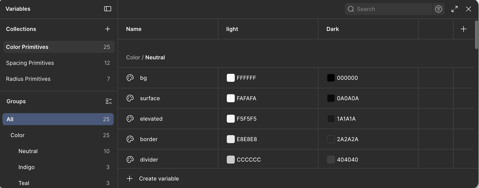
System defined before any screens. Space Grotesk, #4F46E5, 8pt grid, Primitive → Semantic → Component token hierarchy. I specified every architectural decision; MCP ran the build inside Figma.
Phase 5
Claude Code → Vercel
Prompting the portfolio into production code. This is where it got stressful.
Low Fidelity First
The low-fidelity stage is the part most people skip when they use AI. That is a mistake. I spent time in Figma with rough blocks, grey rectangles, approximate type sizes, no content. Testing whether the layout logic made sense. The two-column editorial structure I landed on came out of this phase. I tried three other layouts first. None of them felt right when I looked at the full page. AI did not find that structure. I found it by staring at boxes and asking whether it held.
By the time I started prompting, I already knew what I was building. That mattered more than anything else in the whole process.
Low fidelity is where design intent gets established. If you go straight from brief to AI execution, you have not done the thinking, you have just delegated it. And AI does not think about your portfolio. It produces what is reasonable given what you describe. The gap between reasonable and right is where the actual design work lives.
The Design System
Once the low-fidelity was validated, I locked the system. Space Grotesk. Indigo #4F46E5. 8pt grid. Primitive tokens mapped to semantic aliases mapped to component values. I defined every decision before opening any tool. Everything else flows from a system you have already thought through.
The brief I gave MCP was a precise specification, not a request. I described the token hierarchy, the type scale ratio, the specific hex values, the accessibility constraints. MCP ran the build inside Figma. The thinking was already done.
The output matched the specification. What MCP cannot do is design intent. I tightened section padding to 120px, enforced the two-column editorial structure across all case study sections, and removed every divider. Whitespace became the only separator. That decision came from the lo-fi work, not the tool.
Claude Code
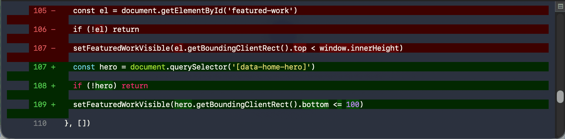
This is the part nobody talks about honestly. Moving from Figma to code felt like the natural next step: I had the design, I would describe it, Claude Code would build it. In principle, that is exactly what happened. In practice, it was messier than I expected.
THE REALITY OF CONTEXT LIMITS
When you are working on a complex portfolio (design system, multiple pages, specific layout logic) you hit token limits in the middle of sessions. The work stops. You have to reconstruct context and re-explain the system you already built. Early on I kept hitting these limits and having to restart sessions, re-establishing patterns, checking whether what had been built in the previous session still matched the design intent. It was frustrating in a way that no tutorial prepares you for.
The discipline that saved me was the same one that worked in Figma: one component per session, fully reviewed before moving to the next. I stopped trying to build entire pages in one go. Each component (navbar, hero, work grid, footer) got its own focused session. I checked the output against the Figma design before moving on. When something drifted from the system, I caught it immediately rather than three sessions later.
The other thing that helped was keeping a running document of every design decision. Not for AI, for me. Font sizes, spacing values, color tokens, the column layout specs. So that when a session reset, I could re-establish the important decisions in one paragraph rather than re-deriving them from scratch each time.
Define the component
Exact specs from Figma
Prompt Claude Code
One component only
Review against Figma
Before anything else
Deploy & check
Real device, real viewport
Decisions
AI EXECUTED WELL
Token build execution
I defined the architecture. MCP executed it accurately inside Figma: 67 variables, 31 aliases, 14 component tokens, all WCAG-passing. When the spec has no ambiguity, the output matches.
I OVERRODE
Visual rhythm
120px section padding, whitespace-only separation, no dividers, no background color changes between sections. These came from the low-fi work, not the prompt.
AI HANDLED WELL
Component consistency at scale
Keeping button heights, input sizes, and card padding consistent across 80+ frames without drift. Not realistic to maintain manually across that many sessions.
I OVERRODE
Every headline
'Most apps treat this as a data problem, not a human one.' Six versions. The edit that sounds like me was the one I wrote. AI got structurally close. Never all the way there.
AI HANDLED WELL
Type scale calculation
Line-heights and tracking calculated from real font metrics, more precise than anything done by eye, and consistent across all 18 text styles.
I DESIGNED
The whole system architecture
Every constraint that made the portfolio specific, from the 280px label column to whitespace-only section separation, was defined before any prompt was written. AI executed decisions. I made them.
Assessment
The portfolio took six weeks. Without AI, the same quality would have taken four months, or I would have made compromises I did not want to make. That is the real value: not removing effort, but making a higher standard reachable within a realistic timeline for someone doing this alongside an M.Sc., a job search, and a family.
The process I ran was not different because I used AI. Same sketching, same mental model study, same low-fidelity experiments, same design system discipline. AI came in at the execution stage and handled the parts that require no judgment. The parts that require judgment were still mine.
What I did not expect was how much context limit management would become its own skill. Knowing when to start a new session, how to re-establish the system in a paragraph, how to structure prompts so the output stays within what was already built. Nobody teaches that. You learn it by hitting the wall a few times.
What I Would Tell Someone Starting This
Do the low-fidelity work first. If you do not know what you are building, prompting is just guessing quickly.
Build the design system before any screens. One hour of system work saves five hours of inconsistency.
One component per session. Review before continuing. Never build ahead.
Keep a running decision document. When context resets, re-establish the system in a paragraph, not from scratch.
AI defaults to safe. Safe is not the same as right. The override is always yours.
The words are yours. The specific thing only you can say does not come from the model.
I did not build this portfolio with AI. I built this portfolio, with better tools than I had before, and a clearer understanding of which parts of design actually require a person.