Problem
Travel planning apps have a discovery problem. They are databases pretending to be experiences — filters, star ratings, lists of coordinates. They answer where but never how does it feel.
Most AI travel tools make it worse: they front-load the AI. Type a city, wait, read a wall of text. The interaction is transactional. Nothing makes you want to go.
Concept
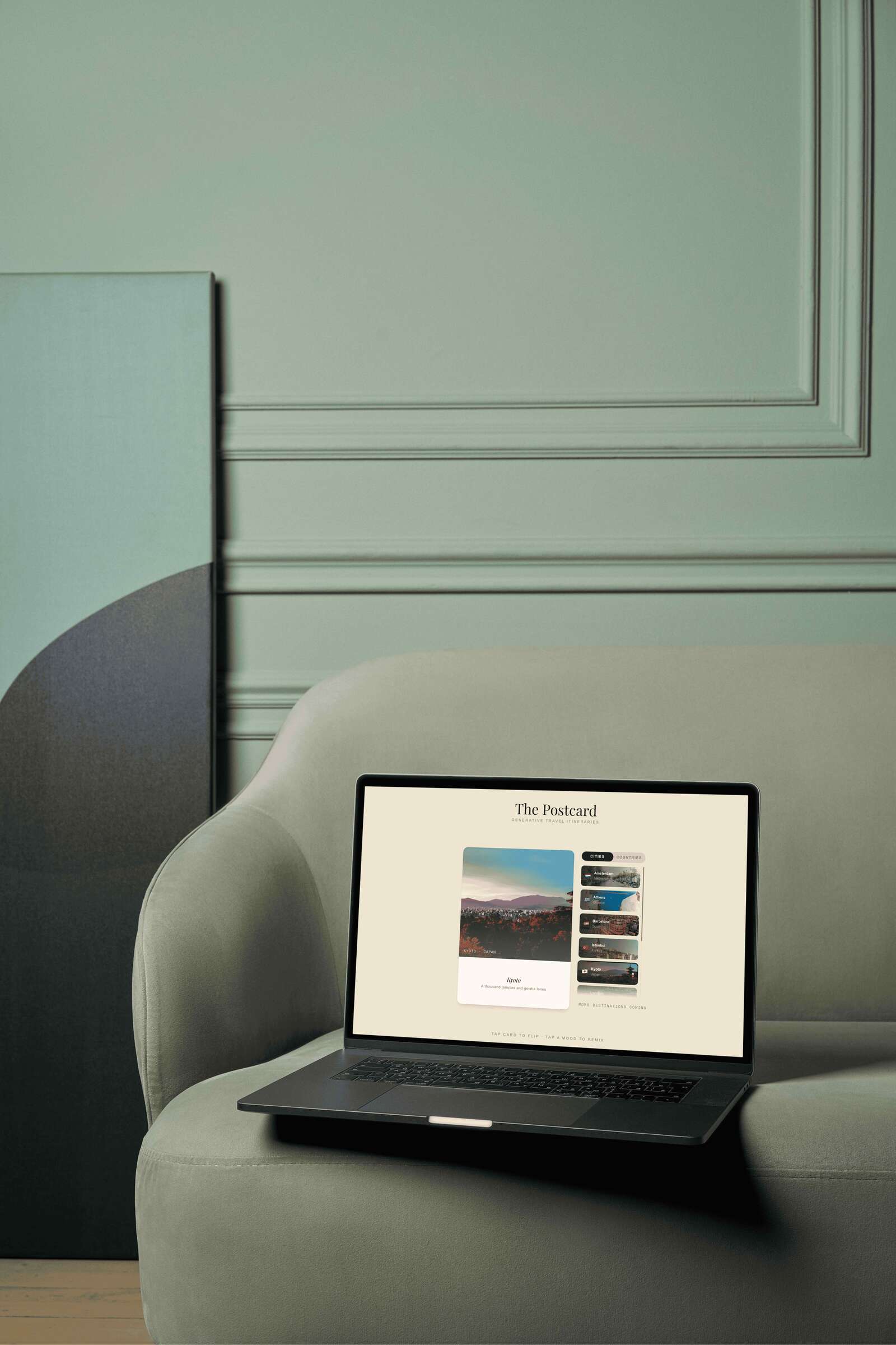
A postcard.
Before smartphones, a postcard communicated the feeling of a place — not a database entry, but a curated impression. A photograph on the front. A handwritten itinerary on the back.
The app takes that physical object and makes it interactive, generative, and personal. The postcard is the entire metaphor: the format, the aesthetic, the interaction model, and the product idea all come from the same source.
Design Language
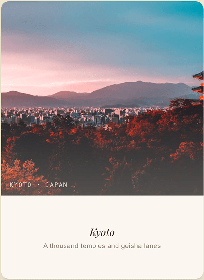
PALETTE
Two anchors. Espresso #2a1f18 for primary text and active states. Warm parchment #ece6d0 as the background — the colour of old paper. No blues, no teals, nothing that reads as tech.
#2a1f18
Espresso
#ece6d0
Parchment
#f5f0e6
Warm white
#8a7e70
Stone
TYPOGRAPHY
Playfair Display throughout the postcard itself — the font of mid-century travel magazines. Clean sans-serif for UI chrome only. The typeface does the work of making content feel trustworthy.
MOTION
The 3D flip uses CSS perspective, transformStyle: preserve-3d, and backfaceVisibility: hidden — the correct implementation most developers get wrong. 550ms ease-in-out. Every animation uses transform and opacity only.
CRAFT DETAILS
The postcard back has a genuine postage stamp built in pure CSS — a perforated edge via repeating gradient. The side panel scrollbar is replaced with a custom 1px track. A gradient fade at the panel bottom signals the list continues.
Decisions
Five decisions shaped this product. Each one changed something fundamental.
DECISION 01
The Palette Changed Everything
The first build used deep navy. It looked like a premium travel app. That was the problem. Switching to espresso-and-parchment changed the product's entire register — from software to designed object. Every subsequent decision flowed from this one.
DECISION 02
10 Great Cards Beats 57 Broken Ones
The spec called for 57 countries and 44 cities. The image service powering most of them had been shut down. Every broken card undermined the ones that worked. Cut to 10 countries and 10 cities — only destinations with confirmed photo IDs. Curation over completeness.
DECISION 03
Content First, AI Second
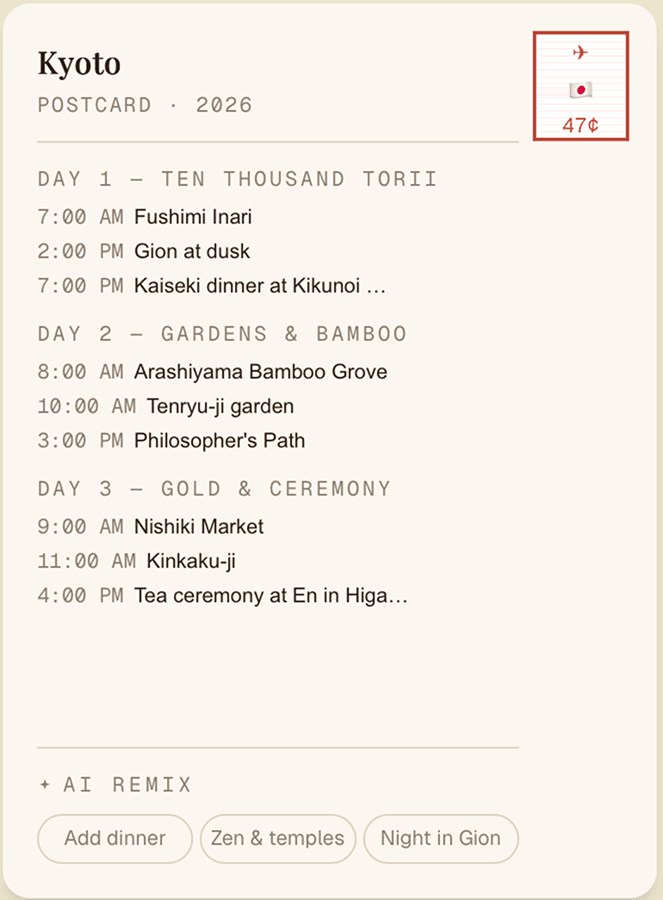
The original flow required an API key to show anything meaningful. Every destination got a fully written, locally specific 3-day itinerary — hardcoded, immediately visible, no credentials required. The AI button became Remix with AI: an enhancement, not a dependency. The app now works completely without AI. Which makes the AI more impressive when it activates.
DECISION 04
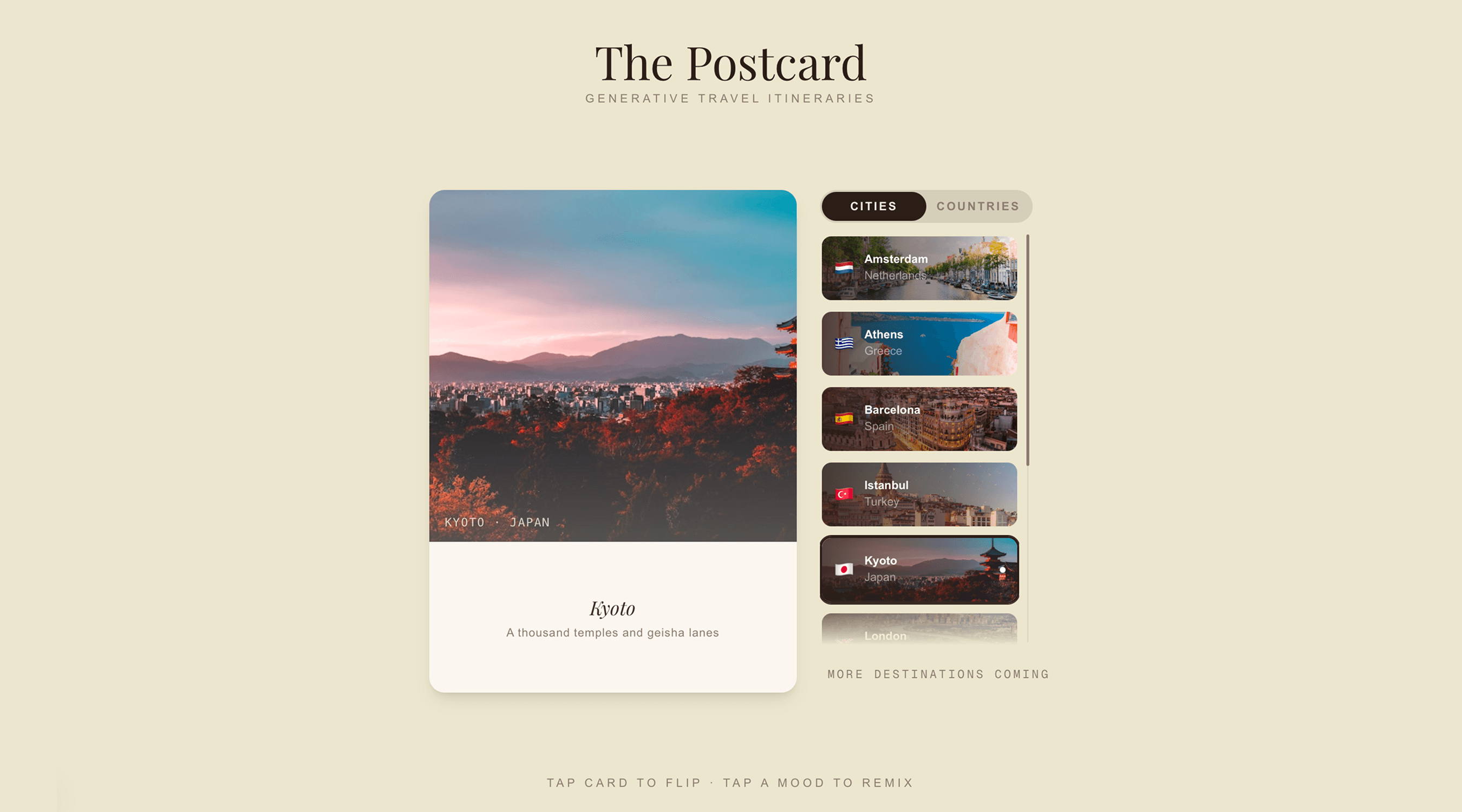
The Layout Shift That Changed the Interaction Model
Original: postcard at the top, destination grid below, click to open a modal. Changed to: postcard left, scrollable destination panel right, clicking a card cross-fades the postcard in place. This shifted the model from browse-then-detail to select-and-explore. The postcard became the live display of wherever you're curious about.
DECISION 05
Remix Buttons, Per Destination
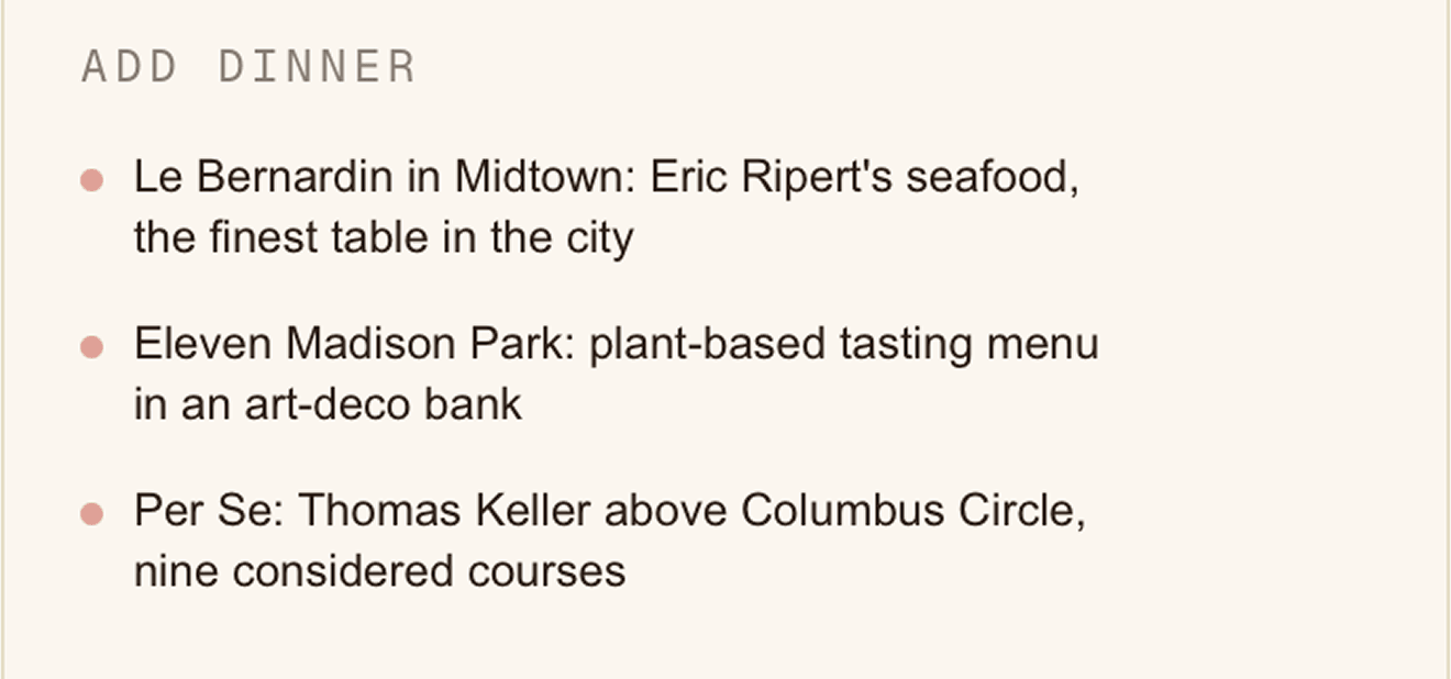
Only the default card had remix buttons. Every destination got three: Add dinner (fixed), plus two mood-specific options grounded in local culture. Kyoto: Zen & temples, Night in Gion. Istanbul: Sufi & spiritual, Bosphorus life. New York: Art & culture, Night owl. Three cycling variants each. The back of every card became a live, interactive surface.

AI Integration
The hardcoded content was written first, deliberately. 20 destinations, 3 mood buttons each, 3 cycling variants per button, 3 vivid lines per variant. Not “visit a museum” but “Borghese Gallery — Bernini’s Apollo and Daphne, 2-hour timed slots, book a week ahead.” Specificity is what makes content feel trustworthy.
The AI layer sits on top as a remix engine. Remix with AI calls Claude via a Next.js API route proxy. The response replaces the hardcoded content. The loading state is a shimmer pulse — a white flash across the card that reads as something is being created, not please wait.
The AI is invisible until you need it. Present the moment you do.
Outcome
This project is a proof of concept for a specific kind of AI product — one where the AI enriches the interface rather than replacing it. The postcard format is the UX. The editorial content is the foundation. The AI is the generative layer that makes it feel alive.
No loading spinners shaped like brains. No “Powered by” badges. No chat bubbles. The interaction is tactile — flip a card, tap a button, something changes.
The result is a travel app that feels like something you’d want to sit with, not something you’d use to complete a task.